Thursday, August 12, 2010

Figure Paintings


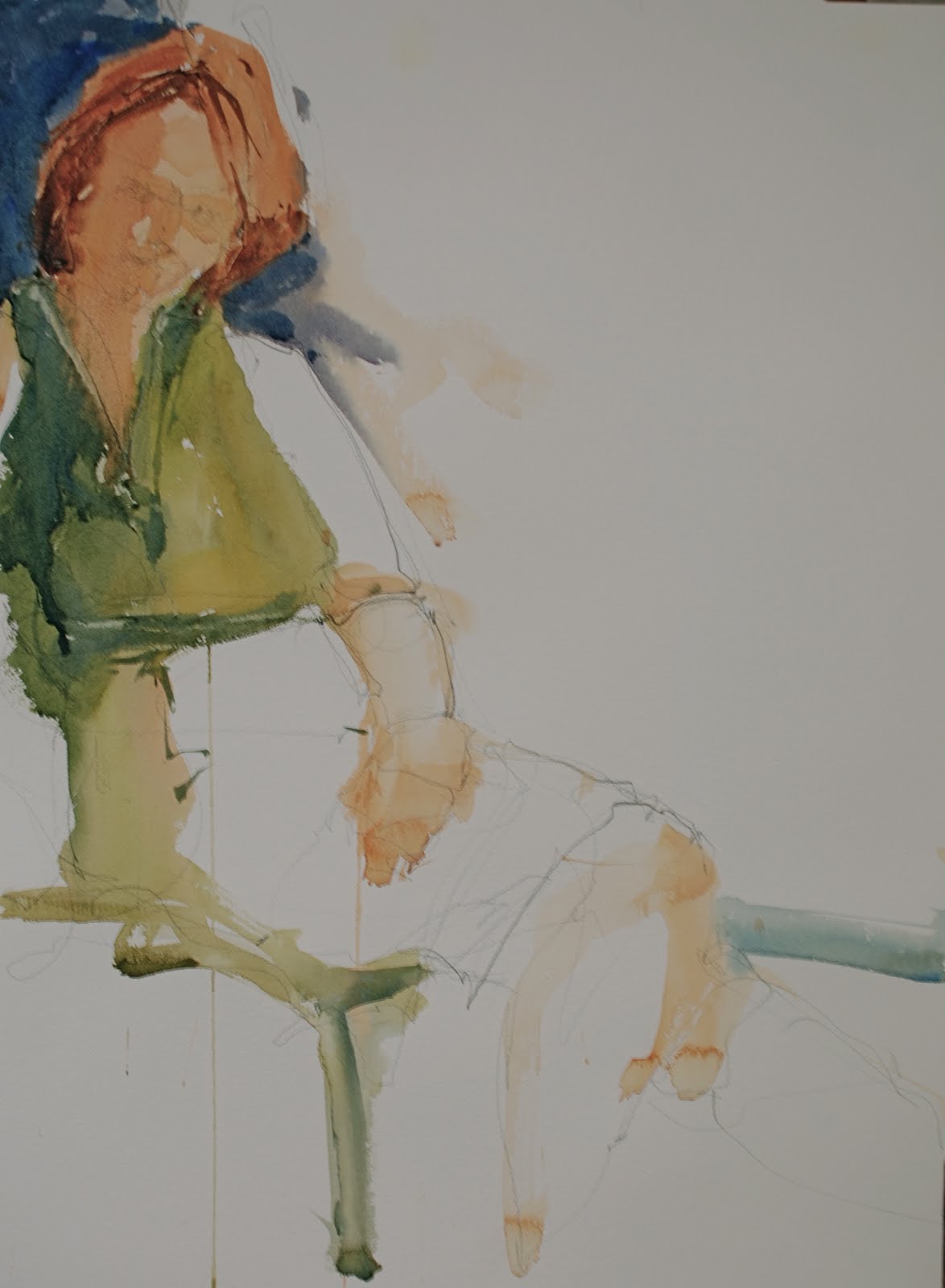
During my last semester of teaching I returned to a style of figure painting that I had left when I was working in a more abstract fashion. This style has a stronger emphasis on the creative use of white paper and a more established and expressive line. The figure becomes more representational but not so much so that it is intimidating to the novice drawer. I think the unfortunate thing for some painters is there reluctance to work figures into their paintings due to their fear of accurate drawing. What they are missing is the fact that unless you are painting the ultra representation figure the model just becomes an interesting shape that can be exaggerated and creatively designed with focus on position on the paper and lost and found edges. No need to project the image and fake your drawing skills just really emphasize the character of the pose and then use dramatic colors, and move the lights and whites in and out of the figure.

Monday, July 5, 2010


I have been working on a couple of paintings for the Studio Gallery All Members Show later on this month which has a theme "Tripping the Light Fantastic". I wanted mine to be minimal, sublime yet powerful so I am working out light just light in a monochromatic palette hoping when done people will need sunglasses to view the work. Wouldn't that be funny if I blinded a few unsuspecting folk, just kidding, sort of kidding, well not really kidding. The pieces I am putting on the blog are not done and will have white over top suggesting glare. Hopefully it is not too trite when finished but it is what I am doing so there. They are about halfway done and I have about a weeks worth of painting in them so far. The white you see is plain gessoed canvas and feels pretty strong to me.

Wednesday, May 19, 2010

A new Southwest Painting


I have been working on the Southwest as an abstract theme since my trip out to Zion and Brice several years back and occasionally hit what I feel is the essence of the place. This new piece is dominated by the desert dryness in the middle of the canvas with long passages of landscape vistas in black. It feels to me like looking down on the salt flats of Utah with its heated dryness and textures of sodium deposits. The orange is the pieces of sedimentary formations that begin to protrude out of the desert at the southern edge of the plain. I have many more pieces of southwest paintings at the Studio Gallery in DC.

Monday, February 8, 2010

Entry to the BWS regional show


I hardly ever enter watercolor shows because I just never know what to submit. I am so involved with the abstract acrylics that I feel rather odd presenting fairly representational work to shows. But after the wonderful 3 day "Moving towards Abstraction" workshop and the feedback I received on my figures I decided to enter 2 figures to the show. I have always thought they were nice and do represent how I would like to paint figures. They have enough detail but are based on a fairly abstract composition and a personal style of handling the medium.

Sunday, December 6, 2009

Two worlds of Steve


As many of you know I am a long time representational painter who loves to paint traditional watercolors. I use both my abstract and representational paintings to improve my vision and artistic language. I make long excursions into abstract painting with the intention of returning to representational with an improved sensitivity and creative interpretation. I have learned strong color, and better design possibilities through my abstract travels and when I return to the more traditional paintings I feel more alive and inspired. Never be afraid to experiment with new ideas for fear that your preferred style will suffer it won't happen.

Wednesday, December 2, 2009

Changes to a painting


When a painting doesn't work even if you kind of like it then it is important that you keep on working with it even if it means a totally new direction for the piece. I am going to show you the before and now version of the piece. I have always maintained that a less than successful painting is not going to improve with age, it is not a good vintage wine that just needs time. So I like the idea of the original because it was my entry into the Africa series but it was too derivative of a whole line of painters and not a very good derivation. So over the next few days I plan to really get into this one and I hope it will work out.

Tuesday, December 1, 2009

Searching and Searching


I spent some time looking at some Franz kline pieces and found his use of overlays of color on top of the ground to be very powerful when played against the starkness of black symbols. For this piece I use a blue ground and came back over it with a very pail white wash that was reinforced with strong passages of white appied with a pallette knife. It definitely is something that makes me wonder if there is more here for me to work on. This is a really small study 16 x 16 and I am planning on giving it some air in a more grand scale.